
America leads the world in a lot of ways. However, anyone who spends time looking at national demographics and statistics (AKA cool people like me) will have noticed that the USA often stands out when compared to other highly developed nations.
I thought it could be interesting to make some maps of the “developed nations” (as defined by the UN and IMF) to highlight a few ways in which the USA stands out from countries with similar wealth and levels of development, and perhaps still has some catching up to do.
(Oh, and I missed off Singapore, because at this scale it would just be a single pixel anyway. Sorry Singapore. I do recognise that you are one of the most developed nations.)
Part 1) Economics and Labour
Map 1: Economic Inequality
 Economic inequality is a major issue in many countries, but in the USA the gap between rich and poor is truly huge. The richest 1% of Americans have more than 35% of the nation’s wealth, while the poorest 80% only have 7% of the wealth. Many of the issues on this list could be traced back to the poverty caused by this wealth disparity. The USA has the most economic inequality of any developed nation, with a GINI index of 41.5%. The next developed nation on the list is Israel, at 41.4.
Map 2: Workers’ Rights

Workers rights in the USA are some of the worst in the developed world, with systematic violations of rights. Only Greece and South Korea are rated worse, with no guarantee of workers rights at all. See a full list here, and read more workers rights violations in the US here.
Map 3: Annual Leave

Following on from the previous map of workers rights, this one shows how many days of paid vacation each country gets. The USA is the only industrialised nation with no legally required annual leave.
Map 4: Maternal Leave

The USA is one of the only nations on Earth with no minimum requirement for maternity leave. Companies with over 50 employees must offer mothers 12 weeks of unpaid leave, but since many poorer families cannot afford to take that much unpaid leave, this ultimately targets the poorest people in the nation.
The nation that gives the most maternity leave is Lithuania, where companies must offer 166 weeks at 51% of normal pay, which is the equivalent of 84.4 weeks of fully paid leave.
My source is the OECD Family Database.
Part 2) Health
Map 5: Universal Healthcare

Like most British people, I’m really biased in favour of universal healthcare. I think it’s great. And in fact it seems that many Americans agree, with some polls showing that over half of Americans are in favour of adopting universal healthcare. The USA is the only developed nation on Earth without universal healthcare. It’s the only nation on this map where people routinely go bankrupt trying to pay for vital medical bills, and where women are charged for giving birth.
Map 6: Healthcare expenditure

Healthcare in the USA is the most expensive of any country in the world. This map is based on data from 2015; in 2019 the average American actually pays over 10,000 USD per person per year. The next country on the list is Switzerland at around 8000 USD. British folk like myself average a little over 4000.
Map 7: Life Expectancy

With an average life expectancy of 78.7 years, the USA isn’t the lowest on this map by any means, but when you compare this with the extortionate cost of American healthcare, it does look pretty bad. Several Eastern European countries do have lower life expectancies than the US, and Greenland has by far the lowest life expectancy of any developed nation (around 71), although the reasons for that are slightly unusual.
Map 8: Infant Mortality

This is a sad one. Here, infant mortality rate is the number of deaths of children under 5 years old, per 1000 births. Only 3 developed nations have an infant morality rate of over 6: Cyprus, Greenland, and the USA. In Iceland, the rate is only 2.1. The reasons for this strange disparity are still debated. If you want to read more about why infant mortality in the USA is so high, check out this excellent article.
Part 3: Crime, Justice, and War
Map 9: Homicide Rate

The homicide rate in the USA is the second highest in the developed world, just behind Greenland, at 5.3 intentional homicides per 100,000 inhabitants. That’s 4.4 times higher than the UK, or 26 times higher than Japan. The total rate of homicide by firearm is 4.46, more than 74 times higher than the UK.
Map 10: Incarceration Rate

A shocking 716 of every 100,000 Americans are in prison, or just over 0.7%. The next highest rate is Taiwan, with a rate of 265. The United States has over 20% of the world’s prisoners. The prison population in the USA quadrupled from 1980 to 2003, despite violent crime rates decreasing. This increase is largely attributed to changes in sentencing laws, such as mandatory minimums, and the infamous “three strikes” laws. The terribly unsuccessful “war on drugs” has also been a huge factor.
Map 11: Capital Punishment

The USA, Japan, Taiwan and Singapore (not shown) are the only developed nations that still practise the death penalty.
Map 12: Military Spending

The United States spends far more on military than any other nation on Earth. America spends 1,985.5 USD per capita on military. It has the second highest level of per capita military spending on Earth, after Saudi Arabia. Israel and Singapore are close behind.
Part 4: Environment and Science
Map 13: CO2 Emissions

America is, per capita, the most polluting developed nation on Earth. Australia, Canada, and Estonia are close behind. Globally, only a handful of Middle Eastern nations produce more CO2 per capita. The USA continually rejects climate agreements, being the only nation not to ratify the Kyoto Protocol, and with plans to back out of the Paris agreement. Around 45% of CO2 in the US comes from the burning of petroleum. This is partly because Americans have a huge reliance on cars, and one of the worse mass transit networks of the developed world. On average, Americans and Canadians also drive some of the most polluting cars in the world.
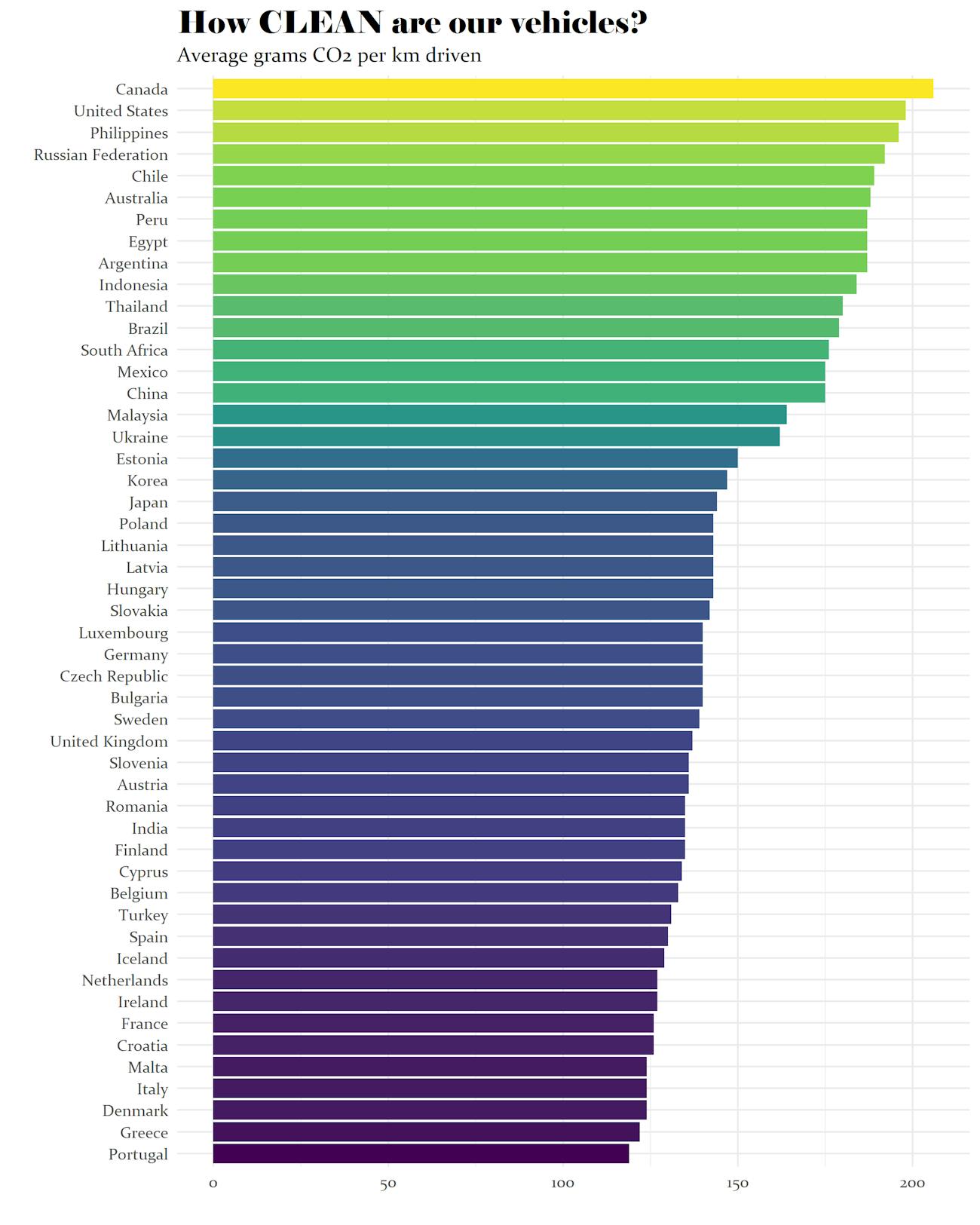
Map 14: Petrol Price

Ok, this may be a controversial one. I’m sure lots of people think cheap petrol is a good thing, and I can understand that viewpoint. However, the correlation between this map and the map above is striking. Countries with cheaper petrol tend to favour cars and personal transport over trains and public transport, and so they tend to produce far more CO2 than similarly developed nations. And so it is not surprising that the developed nation with the cheapest petrol is also the most polluting developed nation on Earth.
Map 15: Science Denial

Despite the huge contributions American scientists have made to all fields of science, a significant percentage of the American public still reject some fundamental scientific facts, such as climate change being caused by human activity, and biological evolution.
Despite global scientific consensus that the theory of evolution is a fact, it is only seen as such by around 40% of Americans. This can probably be attributed in part to the fact the USA is one of the most religious developed nations, with many evolution deniers being Christian creationists.
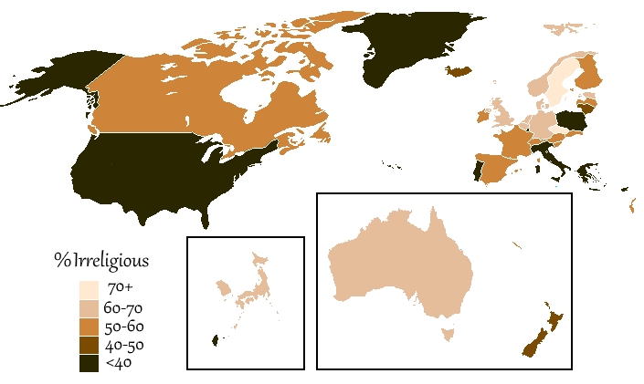
Map 16: The Metric System

As someone with a background in science, I love the metric system, so forgive me for being totally biased here:
While almost every nation on Earth has accepted the metric system as the standard system of measurements, the USA still clings to the imperial system. However, scientists in the USA have adopted the metric system, as it offers many huge benefits to scientific calculations.
It’s easy to see the value of the metric system when you see how the different units relate to each other: a 1 centimetre cube of water weighs exactly 1 gram, and has a volume of one millilitre. It takes exactly one calorie to heat it up by 1 degree Celsius, and exactly 100 calories to take it from freezing point (0°C) to boiling point (100°C). This makes calculating between the units super easy.
The only other developed country that still sticks with non-metric in some instances is, sadly, mine. British roads are still measured in miles, and most British people still measure their weight and height in stones and feet. Beer and milk are also often in Imperial pints.
Part 4: Freedom
Map 17: Press Freedom

Reporters Without Borders categorise each nation by level of press freedom. Only 1 developed nation is categorised as having a “difficult situation”: Singapore (not shown on this map).
However, 6 have “noticeable problems”: Poland, Greece, Israel, Japan, Malta and, as of 2019, the USA. The USA is currently ranked at 49th in the world in terms of press freedom.
Map 18: Total Freedom

With an aggregate score of 86 out of 100, the USA, like all the developed nations, is classified as a “Free” nation by Freedom House. However, of all the developed nations, only Israel, Poland, and South Korea score lower than the USA. Norway, Sweden, and Finland all score the maximum of 100.
This list takes into account factors such as migrant rights, freedom of expression, term limits of leaders, and fairness of elections.
The USA scores well in terms of civil liberties, but loses some points in political rights, such as government transparency and safeguards against corruption. You can see exactly how this score is calculated for the US here, and the full list of countries here.
Well, there you go, 18 maps of the developed world.
I should probably stress at this point that I’m not trying to attack Americans, and I have absolutely nothing against them. Every country has issues, and sometimes highlighting those issues can be a step in convincing people they are worth solving.
If you enjoyed this comic, please check out the rest of the images on my website. And if you have any issues with this post that you would like share, please tell me how you feel here.
Just discovered your website. I love it! Thanks for this wonderful service. 🙂
You seem to have left out a lot of the world.
Read the first line of the second paragraph:
“developed nations” (as defined by the UN and IMF)